SHAPY エステサロンサイト
SHAPY Beauty Salon Site
SHAPY様
for SHAPY
内容
Details
デザイン
コーディング(HTML / CSS / JavaScript)
Design
Coding (HTML / CSS / JavaScript)
プロジェクト期間
Project Duration
2025年3月
March 2025
URL
URL
取り組み
Approach
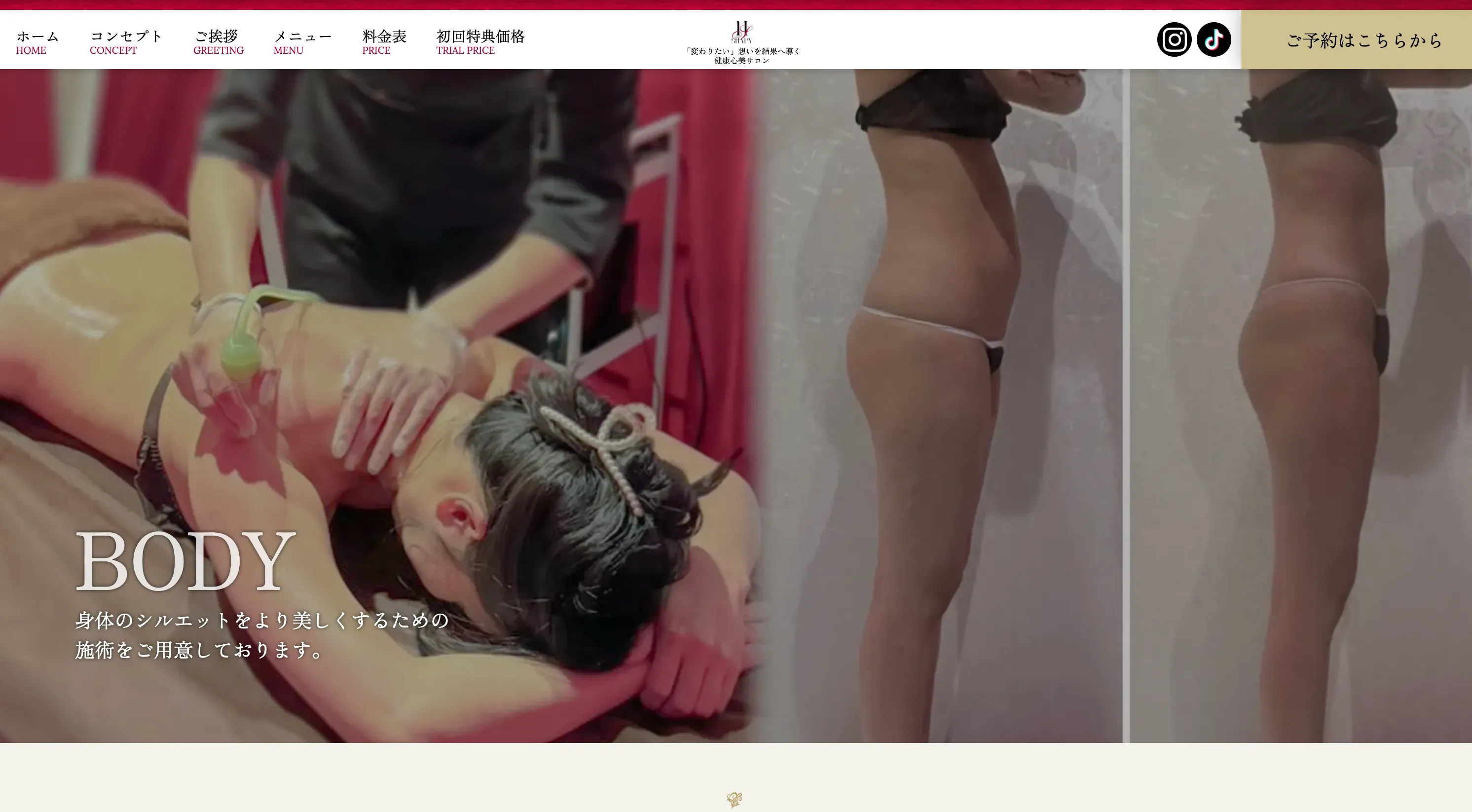
LP形式のサイトから、メニュー数の増加に伴い全面リニューアルを行いました。
スマートフォンからの閲覧が多いと予想されるため、スマホファースト(SP設計)でのデザインを採用しています。
ターゲット層は、美容に関心の高い30-50代の女性。
そのため、エレガントな雰囲気とサロンの世界観をサイト全体にも反映しました。
配色は、ブランドのイメージカラーである赤をアクセントに、ゴールドで高級感を演出。黒を締め色として使用することで、全体のバランスを整えています。
背景に使用しているダマスク柄は、実際のサロンの壁紙から着想を得て取り入れました。
また、豊富なメニューを「3つのカテゴリー」に分類することで、訪問者がお悩みに合わせてスムーズに選択できるように工夫しています。
I conducted a full renewal from an LP-style site due to an increase in the number of menu items.
As I anticipate many views from smartphones, I adopted a mobile-first (SP design) approach.
The target audience is women in their 30s-50s with a high interest in beauty.
Therefore, I reflected an elegant atmosphere and the salon's worldview throughout the entire site.
For the color scheme, I used the brand's image color, red, as an accent, with gold to create a sense of luxury. Black is used as a tightening color to balance the overall look.
The damask pattern used in the background was inspired by the actual wallpaper of the salon.
Furthermore, by categorizing the extensive menu into "3 categories," I have made it easier for visitors to choose smoothly according to their concerns.
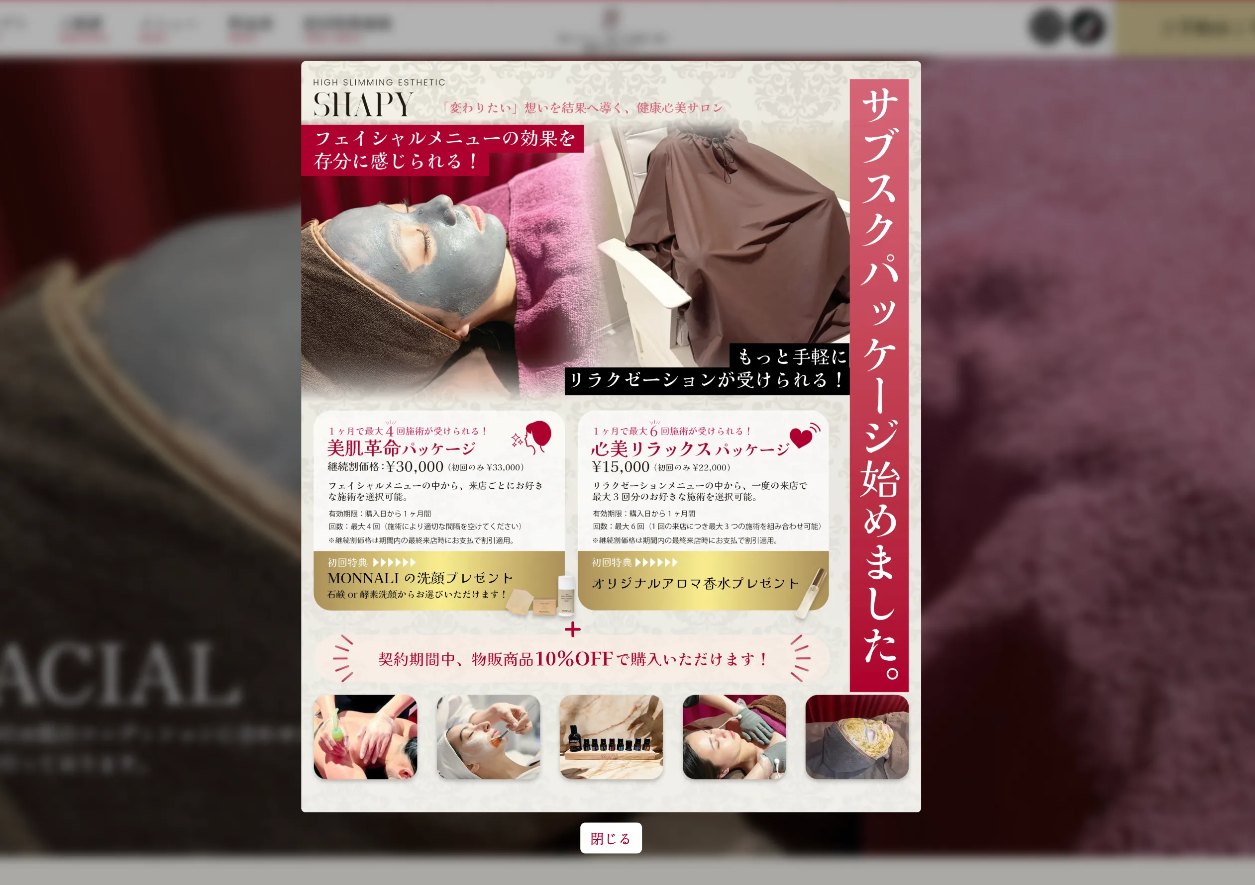
モーダル広告を設けることで、伝えたいお知らせがしっかり届くようにしました。
By setting up a modal ad, I ensured that important announcements are delivered effectively.
制作クレジット
Credits
企画・構成:Kaya Yoshii
デザイン:Kaya Yoshii
コーディング:Kaya Yoshii
撮影:Kazuto Nakajima / クライアント提供
ライティング:クライアント提供(一部修正)
Planning & Structure: Kaya Yoshii
Design: Kaya Yoshii
Coding: Kaya Yoshii
Photography: Kazuto Nakajima / Provided by client
Writing: Provided by client (with some edits)